As a photographer, one of the most crucial aspects of your craft is understanding color space. It plays a significant role in how your images are captured, edited, and displayed.
In this article, I’ll break down what color space is, its principles, and how to choose the right one for your photography needs. By the end, you’ll have a clearer understanding of how to work with color spaces to enhance your images.
What is Color Space?
At its core, color space refers to a specific range of colors that can be represented in an image. Imagine it as a box of crayons; some boxes have only a few basic colors, while others have an extensive array of shades.
In photography, the most commonly used color spaces are sRGB, Adobe RGB, and ProPhoto RGB. Each of these color spaces has its own unique range of colors, known as the color gamut.
The Importance of Color Space
Color space is essential because it defines how colors are represented numerically. This allows for consistent color reproduction across different devices like cameras, monitors, and printers. When you take a photograph, each pixel in that image has specific values for red, green, and blue (RGB), which combine to create the visible colors you see. If you don’t understand how color space works, you might end up with images that look different on various screens or when printed.
What is the Color Space Principle?
 The principle behind color space revolves around the idea of defining colors in a way that can be universally understood by different devices. Each color space uses a specific model to represent colors mathematically. For instance:
- RGB Model: This model combines red, green, and blue light in various intensities to create other colors. Each color channel can have values ranging from 0 to 255 in an 8-bit system. When combined at full intensity (255 for each), they create white; when all are at zero (0), it results in black.
- CMYK Model: This model is primarily used in printing and stands for Cyan, Magenta, Yellow, and Key (Black). It works differently from RGB because it subtracts colors from white light rather than adding them.
Understanding these principles helps photographers make informed decisions about which color space to use based on their workflow and intended output.
Which is Better: RGB or sRGB?
When we talk about RGB in photography, we’re generally referring to the broader concept of color representation using red, green, and blue light. sRGB is a specific type of RGB color space designed for standard displays and web use.
sRGB vs. Other Color Spaces
sRGB:
- Pros: It’s the most widely used color space for web images and is supported by almost all devices and software. This means that if you save your images in sRGB, they will look consistent across most platforms.
- Cons: The downside is that sRGB has a smaller gamut compared to other spaces like Adobe RGB or ProPhoto RGB. This means it can’t represent as many colors, especially vibrant hues.
Adobe RGB:
- Pros: Adobe RGB offers a wider color gamut — about 35% larger than sRGB — making it ideal for photographers who print their work. It captures more variations in color tones and allows for richer prints.
- Cons: However, if you view Adobe RGB images on devices that only support sRGB, they may appear desaturated or dull.
ProPhoto RGB:
- Pros: ProPhoto RGB has the largest color gamut available among common color spaces. It’s particularly useful for high-end editing because it captures an extensive range of colors.
- Cons: The downside is that most printers cannot handle this wide gamut effectively, so it’s not suitable for direct printing without conversion.
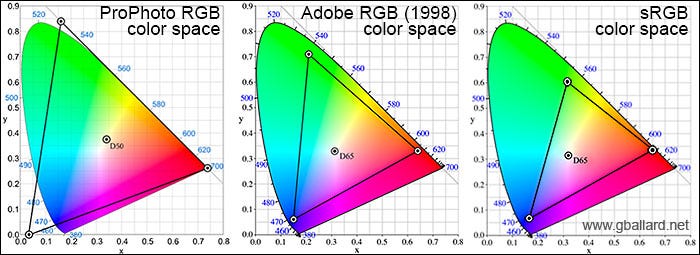
In summary, if your primary focus is online sharing or viewing on standard monitors, sRGB is often the better choice due to its consistency across devices.
What is the Best Color Space Setting?
Determining the best color space setting depends largely on your intended use:
For Web Use
If you’re planning to share your images online — whether on social media or personal websites — sRGB is generally recommended. It ensures that your images maintain their intended colors when viewed on various screens.
For Printing
If you’re working with prints — especially high-quality ones — Adobe RGB is usually more suitable due to its wider range of colors. Many professional printers can take advantage of this expanded gamut to produce more vibrant prints.
For Editing
When editing photos in software like Lightroom or Photoshop, consider using ProPhoto RGB during your workflow. This allows you to maximize your editing potential by retaining as much detail and variation in color as possible before exporting your final image.
How Do I Choose a Color Space?
Choosing the right color space involves several considerations:
1. Determine Your Output Needs
Ask yourself where your images will be displayed or printed:
- Online Sharing: If you’re sharing images online or on social media platforms, stick with sRGB.
- Prints: If you’re preparing images for print — especially fine art prints — lean towards Adobe RGB.
2. Camera Settings
If you’re shooting JPEGs directly from your camera, set your camera’s color space accordingly:
- For web use: Set it to sRGB.
- For prints: Use Adobe RGB if available.
If you shoot RAW files (which I highly recommend), remember that RAW files do not embed any specific color profile until you process them.
3. Editing Software
Most editing programs default to ProPhoto RGB for RAW files because it allows for maximum flexibility during editing. However, always remember to convert your images to the appropriate color space before exporting them:
- For web use: Convert to sRGB.
- For print: Convert to Adobe RGB if needed.
4. Monitor Calibration
Ensure that your monitor is calibrated correctly to display colors accurately within the chosen color space. A calibrated monitor will help you see what others will see when they view your images on their devices.
When it comes to choosing the best monitors for photography or video editing, MSI and Lenovo stand out as top contenders. MSI offers a range of high-performance monitors and laptops specifically designed for creative professionals, ensuring vibrant color reproduction and exceptional clarity. Their products often feature advanced color calibration tools and wide color gamuts, making them ideal for photographers who demand precision in their work.
On the other hand, Lenovo‘s ThinkPad series is renowned for its reliability and performance, equipped with displays that provide excellent color accuracy and brightness. Whether you’re editing photos on the go or setting up a dedicated workspace, both MSI and Lenovo deliver the quality and performance that serious photographers need to bring their visions to life.